Saturday, August 30, 2008

Steamy photographs

We did Murph the other day- one of my favorite Hero workouts: Run 1 mile, then do 100 pull-ups, 200 push-ups, and 300 squats. Finish with another mile run. I re-opened a few of my callouses from Cindy but thought I'd spare the blogosphere another shot of my ripped-up hands. Instead, I'll just post a picture of one of my workout partners, John. He had just finished Murph, come in from his 2nd mile run, and collapsed on the mats. When I went over to talk to him, I couldn't believe my eyes- he was actually steaming. It had been raining and John was soaking wet. When he laid down on the floor, the water started to evaporate leaving visible tendrils of smoke wisping off of his t-shirt.

It was a phenomenal sight so naturally I grabbed my camera. Never having shot steam before, I had no idea what I was doing. I tried shooting from different angles, ordering John to "sit still..... don't move" (to which he'd reply, "I don't WANT to move.") I tried using short exposures, long exposures, wide aperture, narrow aperture, and every permutation in between. Nothing worked. I could see on my camera's LCD screen that it wasn't showing up.

This was really upsetting me and I hated that I couldn't capture the effect that I could see with my own eyes. Later on I had an idea- why not add some steam artificially? I mean, isn't that what Photoshop and Gimp are for? Besides, it's not like I would be making up a fictious event; it really did happen. I just couldn't capture it with my camera.

So I searched the web and found a few tutorials for creating things like fog, clouds, and smoke, but nothing specific for steam. I tried the smoke suggestions (In GIMP: draw white lines on a new transparent layer and then alternately apply a Gaussian blur with the IWarp effect until satisfied with the result. Finally, adjust the opacity to minimize its presence) Well..... it didn't quite work out as I had hoped. I was never able to get the beautiful laminar flow that I saw floating off of John's shirt, but I make myself feel better by telling myself this is just a first pass. I will keep working on the technique until I feel it captures what I saw yesterday.

Until then, here is the shot of John pseudo-steaming, post-Murph.
 

Tuesday, August 26, 2008

Reflections


A while back I tried to do some creative shots with the mirrors in our gym but was ultimately foiled by 1) the reflected flash from my camera was too distracting, and 2) the mirrors weren't very clean and every smudge was highly visible in the photos. So I gave up on deliberately trying to use the reflection as an artistic device. But every now and again it comes in handy. For instance, the above shot originally looked like this:
 
It was the result of one of those random shots you take just to capture the general hubbub of a workout with no real attempt at framing or composition. After I went through all of the shots, I thought this one might be worth some more work. In the background, Aaron Riley (one of our MMA instructors), was talking to Brown (our CrossFit instructor) and striking a fighting stance. Originally I tried to crop it so both Brown and Aaron were in the shot, but the barbell in the foreground was too distracting as it cut across Brown's legs.

My solution was to use the reflection in the mirror. I realized I could crop out Brown without losing his presence because he was perfectly reflected in the mirror. The result is a much tighter shot of Aaron and a more interesting picture, I think. The bumper plate of the barbell is still visible, but it's not nearly as distracting as in the original.

Finally, I converted to grayscale using filtered black & white, and then added a pale yellow tint just to see how it would look. I liked it so I kept it that way.

Friday, August 22, 2008

Hurts so good

 
A common sight on many CrossFit blogs is a Broken Blisters shot. For some reason, we feel the need to document our pain. We wear these scars proudly, men and women alike. I never would have thought I'd succumb to this odd form of vanity but as soon as I finished Cindy today and saw how shredded my hands were, I said, "Quick! Take a picture!" Yong gets credit for this shot, using my Canon Powershot. I used selective colorization just for the heck of it- my palms were so pink and raw, I wanted that to be the main focus. Then I tweaked the contrast to bring out blisters and cuts a bit more. How sexy is that? I guess I was just elated because I had set a new personal record and it was the first time I had done Cindy as Rx'd. As I type this now, though, the skin is tight and painful (which is why the selective colorization is so sloppy. Sorry 'bout that!) Ah well, sometimes you have to break a few blisters to break a PR.

For more shots of today's workout, visit 080822Cindy

Wednesday, August 20, 2008

More fun with motion

 
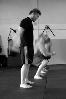
Today's workout was a beast. Burpees and Squats- lots of 'em. I wanted to do some more experimentation with slower shutter speeds so I delayed my own workout so that I could shoot everyone else's. This was probably one of the best ones I took. After MUCH trial and error (I started with my aperture too large and my shutter speed too fast) I finally started getting some decent shots. I like this one because it has a stationary subject as well as moving ones. John (in black) was about half-way through his workout when he took a few seconds to regroup. Ben and Raman (the blurs) were forging ahead in the background. To get the shot I used a shutter speed of 1/8 sec which is longer than I'm comfortable with and very difficult to hold steady. But I took advantage of John's stationary pose and focused on him and it worked out.

My one regret is that the ISO is so high (800), leading to more noise than I care for. By this time I had stopped down the aperture to f/11 so that I had a generous depth of field in which to work. This results in less light getting to the pixels, though, causing the camera to compensate by using a faster ISO. If I had used a wider aperture to let in more light, my pictures might have gotten more blurry due to the narrower focal range. It's all about trade-offs; my problem is, I don't know how many more feet each f-stop buys me in terms of depth of field so I can't estimate on the fly what my setting should be. This is why I experiment.

Here's another example of what happens when you experiment:
 
I honestly don't know how I got this shot, but it's kinda neat. I know I was playing with panning and the second curtain (also called trailing curtain) flash mode which synchronizes the flash with the end of an exposure. This gives a sharp crisp impression of the subject rather than an amorphous smear across the image. As you can see (and against all possible odds), Ben's face is in focus while everything else around him has a weird ethereal smeared look to it. What I think happened was this: instead of just snapping the picture and letting the trailing curtain flash do it's thing, I picked a point (his face) and panned the camera while he did his burpee to keep it stationary. This was a little tricky as you have to follow the person for a few reps and get a sense of their rate. (pssst- you get better shots toward the end of a workout because people are 1)slower, and 2)more expressive. A nice sheen of sweat helps to round out the image as well.) Anyway, somehow this shot came out but I'm not sure I could do it again. I also liked the color so I kept it as is.

For more of my experimental shots, check out Burpees Up, Squats Down.

Saturday, August 16, 2008

Flirting with slower shutter speeds

 
One of the things I've been working on for a while is motion blur. It has such an aesthetic effect when done correctly, but it's so challenging to do well. If your shutter speed is too slow, you risk having everything blurred; if your shutter speed is too fast, you may have a nice sharp picture, but no sense of motion. This isn't necessarily a bad thing, but sometimes you get bizarre shots like this one where athletes seem eerily suspended in space:
 
So far I've found that the most important thing in getting a decent motion blur shot (assuming the exposure is ok) is keeping your main focal point in focus. There are a couple of ways to achieve this, including panning or using a fancy mode on your camera called second curtain flash mode which will "freeze" the subject in space while preserving a trail of motion blur behind it.

In the picture of the guys doing squats, I chose a much less sophisticated option: timing. I simply waited until my subject was momentarily stationary to take the shot. Prior to this, I focused on Yong's face (in black) while he was standing still. Once they started doing squats, I timed my shot so that it clicked just as he reached the top of his extension. I used a 1/15 sec shutter speed to give a slight blur to everything that wasn't stationary; in hindsight, I probably could have gone to 1/30 sec to get some more detail in the other squatters. But the result is that his face is (relatively) in focus while everything else has a slight blur to it.

How to decide what shutter speed to use? I'm sure there are probably some rules of thumb but I don't know what they are. I just use trial and error. The challenge is that different movements have different rates of speed so one exercise (like squats) may use a relatively slow speed while running might need a faster shutter speed. Since I don't have an innate ability to know what blend of ISO, aperture, and shutter speed will result in the best image, I basically try them all. It results in a lot of throw-away shots, but every now and then I get a little closer and closer to the effect I'm seeking. More on this later as I continue to experiment.

Thursday, August 14, 2008

Never Accept Defeat: Lee Bae-young


This is Lee Bae-young, an Olympic weight lifter from Korea, and my new personal hero.

Lee Bae-young was in second place after the Snatch competition but I watched him lose all hope of a medal a few days ago with this final attempt at lifting 186kg during the Clean & Jerk. He tore a calf muscle on his first attempt (at 184kg) and then increased the weight to 186kg on the second attempt to get a little more time to recover. He failed on the second attempt as well. By the third attempt, everybody in the crowd was hoping he'd somehow do the impossible. I was too. He hobbled out on a tender ankle, committed himself to the lift, and then hoisted it into the air. He lost control of the weight right after the squat and gravity took over. Even as the barbell rolled across the floor, he refused to let go, his body dragging behind it.

That image of him clinging to the bar as it (and any chance of a medal) rolled away from him is etched on my brain. I've been haunted by these images ever since. It's not so much that he failed; it's how he refused to let go, even as he took it to his knees, even as it dragged him across the floor. When faced with the impossible, he still committed himself to it 100% and never let go, even when the impossible became the inevitable.

I wish I had the heart that Lee Bae-young showed the world on this day. I wish I attacked my challenges with the same fighting spirit Lee Bae-young did, even in the face of the impossible. Because all of us fail at some time or another, but few of us meet defeat the same way Lee Bae-young did: fighting and clawing for that dream the whole way down.

Monday, August 11, 2008

Creative Cropping

 
If you're like me, you've got albums filled with "too" pictures: pictures that are too fuzzy, too dark, too grainy... you get the idea. I'm a terrible photographer. For every 100 shots I take, maybe 2 come out as I had hoped. That means that 2% of my photos are made up of good shots; the rest are made up of "too" shots. Very frustrating.

In light of this abysmal success rate, I am constantly in search of clever ways to maximize my output. One trick I tried tonight was some creative cropping. The picture above is the result. Kinda interesting, I think. This is how it came about:
 
That's the original picture of Jank doing a Sumo Deadlift High Pull during Fight Gone Bad. For whatever reason, my camera decided to focus on Jank's left elbow instead of the awesome expression of pain etched on his face. (Ah $#!+ that would have been a great shot...) Unfortunately his face is just too out of focus to salvage the shot.... what to do, what to do?

Ok, maybe his elbow wasn't what I wanted to focus on, but that's what I've got, so what can I do with it? The picture is cluttered with crap at the bottom, and the red mats are partially held up with electrical tape towards the top. Ugly. There is an area of uniform background, however, around the torso- right near Jank's perfectly focused elbow.

On a whim, I decided to crop the picture so that the elbow was the focal point. Within Picasa's Crop tool, there is a Manual option that lets you crop a non-traditional aspect ratio. After trying several different rectangles, I settled on a square shape (hold down the shift key while you click and drag to keep the 1:1 ratio) and basically moved it around to see what kind of new image I could create. Through trial and error I discovered I could capture the gist of his facial expression without showing his whole face by cropping just above the nose. Cool.

As for the size of the square, I used the Rule of Thirds- a general principle in photography that suggests dividing a photograph into thirds, both horizontally and vertically. The Rule of Thirds suggests that important elements should be placed at the intersections of these lines to achieve balance. It seemed to work because as soon as I adjusted the square so that the elbow (the focal point) was near the lower right intersection, it seemed to click as an image.

After I cropped it, I used Picasa's Sharpen tool to make it a little more crisp. This tool doesn't always work- sometimes it can augment noise and give a more grainy appearance, but in this instance it offered some improvement. Finally, I converted it to black & white.

In all honesty, I'm surprised at how it came out. It's far from perfect, but it's certainly an improvement over the original picture. The original was mediocre, cluttered, and poorly focused; the cropped one is interesting and different.

I guess the lesson learned is to try anything when it comes to cropping. I never would have thought to do a close-up of somebody's elbow, but now that I'm forced to try it, it makes me wonder how many other photographs I can save with creative cropping.

Sunday, August 10, 2008

Straightening Crooked Shots

 
Emphasizing intensity.
This is Raman. I took a shot of him during one of his first few workouts at our gym because I was so impressed with his intensity as he tackled his squats. He works hard, never complains about a workout, and never makes excuses why he can't do something.... he just does it no matter how long it takes.

I like this shot for several reasons. First, it's not cluttered with other people, equipment, etc. There's nothing to compete with the main subject. Second, I like how Raman's face is in focus while everything else is slightly blurred. This helps draw the attention straight to his eyes where all the intensity is. After learning my lesson from the first time I used my 50mm lens, I made sure to stop down the aperture a bit (from 1.4 to 2.4) so that my depth of field wasn't so shallow. This gave me some more wiggle room to get the focus just right, while still allowing me to take an indoor shot without using the flash.

Picasa's Straighten Tool
Unfortunately, I was a little careless when I took the picture and saw later that it was crooked (see below). Even when I cropped out the artificial horizon, you could still tell that the subject was leaning askew. Luckily, Picasa has an easy Straighten feature that lets you make minor corrections by tilting the photo a few degrees left or right.
 
After I straightened it using the superimposed guidelines, I cropped it so that there was nothing else in the background. It's amazing how effective cropping is at improving the quality of an image. In the original, the look of determination has to compete with the bright reflective mirror in the background. Once you crop all that out, the eye is free to study the main theme- absolute dedication to finishing the workout.

Saturday, August 9, 2008

Minimize distraction to focus attention: The Clone and Smudge Tools

 
Sometimes the shot is of the fan, not the athlete
There is no doubt that children are an integral part of the CrossFit community. Whether they are doing their own scaled WOD, or cheering on mom or dad, their faces can tell another side of the story not reflected in the rest of us. Above is a shot of Lil' Beaner Bee who was thrilled to see her mom and dad cross the finish line after they disappeared momentarily to run a 400m sprint. I had taken some shots of her parents racing each other, but they weren't as precious as the one of their daughter reacting to them. I guess the lesson learned (for me) is that the audience can be every bit as exciting as the athlete.

In order to focus on her glee, I decided to crop it tight. The darkened gym and red mats naturally framed her face. Unfortunately, there was an annoying white sheet of paper on top of the mats that I couldn't crop out. Given the simplicity of the scene, I found that paper to be quite distracting. In The Joy of Digital Photography, Jeff Wignall points out that the fewer elements are in a photo, the more important each one becomes. Therefore you should minimize extraneous items because they draw attention away from the main subject.

Cloning and Smudging Tool
Unfortunately, Picasa does not include a tool to remove items from a photograph. But both GIMP and Photoshop have a Clone tool which allows you to copy a part of your photograph from one location to another. In this case, I wanted to copy some red from one section of the mats and "paint" it over the white paper to erase it from the scene.

  
Above are two shots showing this effect. On the left is the original shot showing the white paper. The newly cloned image is on the right. Not bad.... but the cloning tool isn't perfect and sometimes it leaves sharp edges where the shades of red don't blend perfectly. (You can see this if you click on the thumbnail and view the full size image.) I used the Smudge tool to manually blend the colors all around the perimeter of the paper and got the following result:
 
I can still see unblended areas but I'm not too concerned because I plan to crop it. Using Picasa, I finish the photo by tweaking the shadow and highlight features (to add more contrast between her face and the darkened background) and then bringing the temperature slider to the right (warmer) to get rid of the slight green cast. Finally I cropped it to include a large portion of the red mats because I thought the pattern was interesting and helped to frame the picture. Here's the final before and after:
  

To see the rest of the pics from today's workout, visit Crossfit OSMA Olympics

Thursday, August 7, 2008

Selective coloring: Hasan's Flags

 
Perhaps it's because the Olympics are just around the corner and I'm feeling particularly patriotic. Or perhaps it's because my gym has these frickin' H-U-G-E flags hanging from the rafters and they demand your attention as soon as you walk into the gym. Either way, I was moved to feature them in one of my pics since they are such an iconic part of One Spirit. Some gyms have T-Shirts from all their affiliate friends, some gyms have photographs featuring all their alums, we have flags representing the countries of all the martial arts styles we practice.

So I went through my archive and found a shot that featured the flags prominently. This shot is crazy emotional too because Hasan and Yong were doing Fran, going head-to-head, while Treefrog and everybody else was cheering them on. His facial expression says it all: he's giving it all he's got.

Rather than convert to black and white (as I do so many of my other pics) I decided to emphasize the flag by doing selective coloring using GIMP, a free photo editor available online. Selective coloring can be a little tedious depending on the shape you are coloring, but if you've got a suitable pic then it's worth the time investment. Here's an excellent tutorial that walks you through the steps: Selective Color Tutorial

If you don't want to bother with all that, all hope is not lost. Picasa has a very rudimentary feature that will let you achieve a similar effect. The Focal Black & White feature lets you identify a circular region on your photograph within which it preserves color; everything else is converted to grayscale. That's how I did the image behind the title in my blog header- kettlebells are round so Picasa's circular shape was perfect. If I had wanted to do any other shape, or multiple shapes, I'd have to use GIMP or Photoshop to do it as above.

Now, a word on cropping. In the picture above, I chose to focus on Hasan and the American flag, however the cropping doesn't let you see the whole picture. In the one below, you see what was actually going on- Jorn was coaching Hasan through each thruster, pumping his fist in the air with each extension and driving the crowd into a frenzy. Hasan wasn't alone lifting that barbell, it was truly a team effort. In honor of that team spirit, I decided to color a second version showing Jorn with raised fist and all of the flags in their full glory. Each picture tells a slightly different story, and I think each one is inspiring in their own right.
 

Wednesday, August 6, 2008

This car brakes for Crossfit-ers


Normally I prefer photographing people as opposed to inanimate objects, but I never pass up an opportunity if one presents itself. I got a kick out of this. One day we were all at the gym wondering where Brown was (he's rarely late). Suddenly his friend pops in and says Brown's having car trouble and will be here shortly. When he finally arrives, he runs into the gym, grabs a hex dumbbell, and runs out again. We go out to see what's going on and there he is standing next to this ancient Lincoln Continental with - no shit- fuzzy dice hanging from the rear-view mirror. As I'm 'admiring' the whitewall tires, I notice the dumbbell (now a makeshift parking break) wedged under the front tire. Click. That's a keeper.

I cropped the shot nice and close to emphasize the curves of the wheel and the fender. I also tweaked the contrast ever so slightly, but otherwise left it as is. It may look black and white, but that's just because there was very little color in the composition. Mainly I like the shot because it makes me chuckle, but there is also an underlying message here that may not be apparent to the casual observer: for something to be truly useful, it has to be functional under all sorts of environments, from the mundane to the extreme. Much like this free weight, the most functional athletes are those that can perform multiple tasks under wildly different and unexpected circumstances. Warfighters, first responders, and law enforcement officers already know this. The rest of us are just now waking up to that fact. That's what I love about my gym; we strive to reach this goal with every workout we tackle.

Tuesday, August 5, 2008

More on Colored Filters

OK, more on colored filters. In my gym, we have a lot of blue mats on the floor and red mats along the walls. This makes for some nice uniform backgrounds if you've got the angle just right, but sometimes the color is just too distracting. I've been playing around with Picasa's filtered B&W option and found I can change the whole look of a picture depending on what I want to emphasize. The three photos below (from our Fourth of July workout) illustrate this. The first one shows the original color shot: a fair-skinned subject with interesting tattoos against a bright red background. It's ok as is, but the original photo doesn't do justice to the subject. So I can play around with the colored filters to achieve different effects.

   
In the second shot, I've used a color filter complimentary to the red mats: a green filter. This has the effect of blocking the light coming off of red objects, or darkening them. It's a nice option if I want to isolate the subject and make him stand out from the background, but in this particular case, the result also leaves his skin looking washed out and fades his tattoos which I want to emphasize. Another option to consider is to use a red filter. The red filter allows red light to pass (effectively making it lighter) while darkening complimentary colors. This results in less contrast between his skin and the background, but more defined ink and musculature, which is what I wanted.

My main complaint is that the focus is a little soft (remember this was my first day using my 50mm lens so I had it wide open (f/1.4) resulting in soft lines and a very shallow depth of field....) Still, not too shabby.

Saturday, August 2, 2008

Bucket

 
Brown got, like, NO sleep the night before. And he took it out on us in the form of a Tabata workout. When you do a Tabata, you do 8 reps of: 20 seconds of work followed by 10 seconds of rest. You record the number of reps on each set, and then here's the kicker- you only score the lowest number. So if your 8 sets of, say, sit-ups looked like this: 15-15-14-15-14-13-13-10, you would only score a "10" on that exercise. The magic formula is pacing, and consistency.

So we all suffered through our tabata workout (kettlebells, burpees, sit-ups, squats) while Brown kept time. Then it was his turn. Intent on getting the best score, he powered through it like a maniac. After beating Treefrog by one point, he collapsed and groaned a single word: "Bucket......" We produced a trash can for him and I snapped this shot fully intent on posting it on my blog, consequences be damned.

In all seriousness, I love this shot. It could easily be any one of us on any given day. And it symbolizes what my gym (and countless others like it) are all about: Never quitting. So the workout is hard? Good. So you feel like shit? Nobody cares. So you're gonna vomit? Try not to spew on the mats, thanks. It's all about setting a goal and then accomplishing it, no matter what, no excuses. If you can do that in the gym, you can do that anywhere.

See SucksForEverybody for more shots from this workout.

Friday, August 1, 2008

Another silhouette

 
Today's workout was a hang squat clean ladder. Everybody does one lift. Then everybody does two lifts. Then everybody does three lifts..... you get the picture. People drop out with increasing reps/weight until there is one winner left. My shots today weren't that great because I was doing them in between my sets and Brown kept yelling at me to "put the camera down!!". Nevertheless I really liked this shot. This one isn't in perfect focus, so I upped the contrast a bit and fell back on good ol' B&W to give it an edge. Once again, the garage door makes for a real difficult shooting environment but I'm learning to work with it. Aaron (the lifter) has a nice highlighting effect that separates his silhouette from the darkened background (which is also mirrored in the yoga balls), and Brown is completely backlit, making his silhouette stand out from the bright background.

The rest of the pics (most of which were taken by Brown) can be found at DuelingBanjos